
Context
01 I A sibling, not a copy
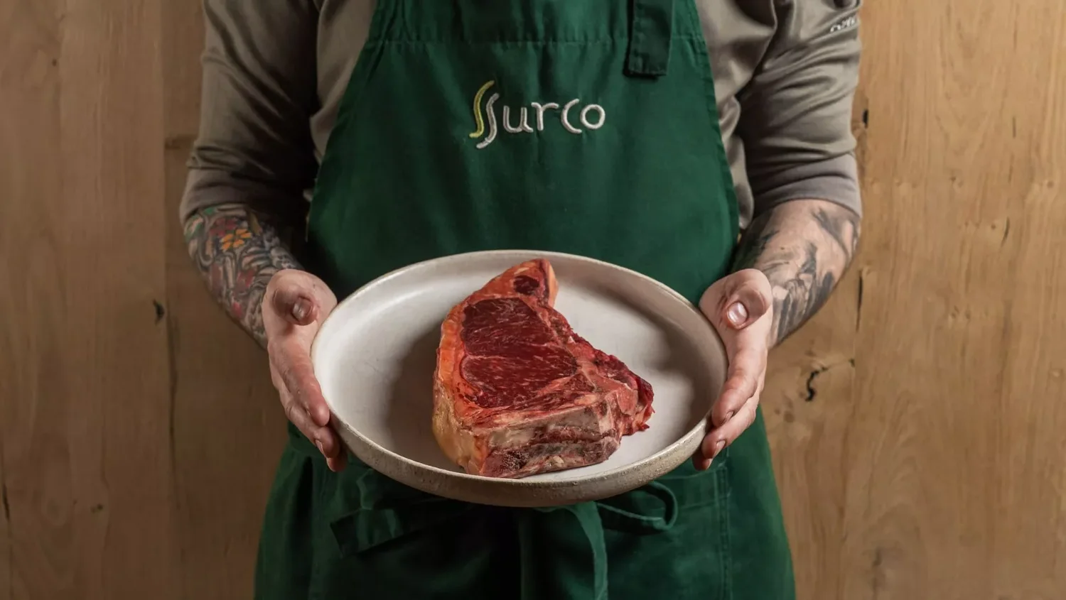
SURCO was set to open in Ávila, an hour from Madrid, as the smaller sibling of Barro, the Michelin-starred restaurant by Carlos Castillas. It needed a full branding that could live in harmony with Barro while standing clearly apart from it.
What I did
- Logo design and favicon
- Color palette and typography
- Custom graphics and icons
- Tone and voice
- Menu design
- Posters and tags

- Brand development
- Strategic design
- Creative direction
- Logo design
Direction
02 I More than a mark
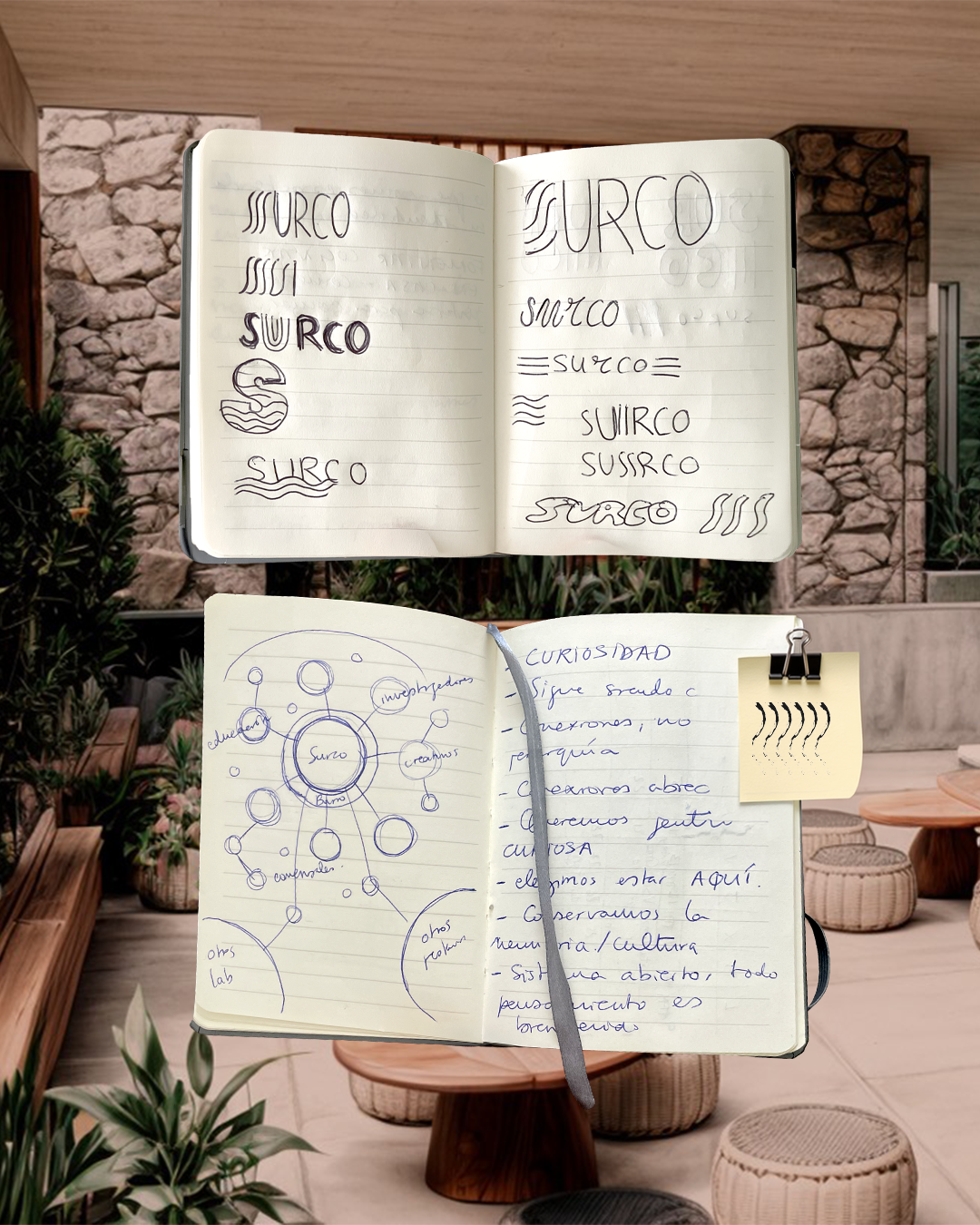
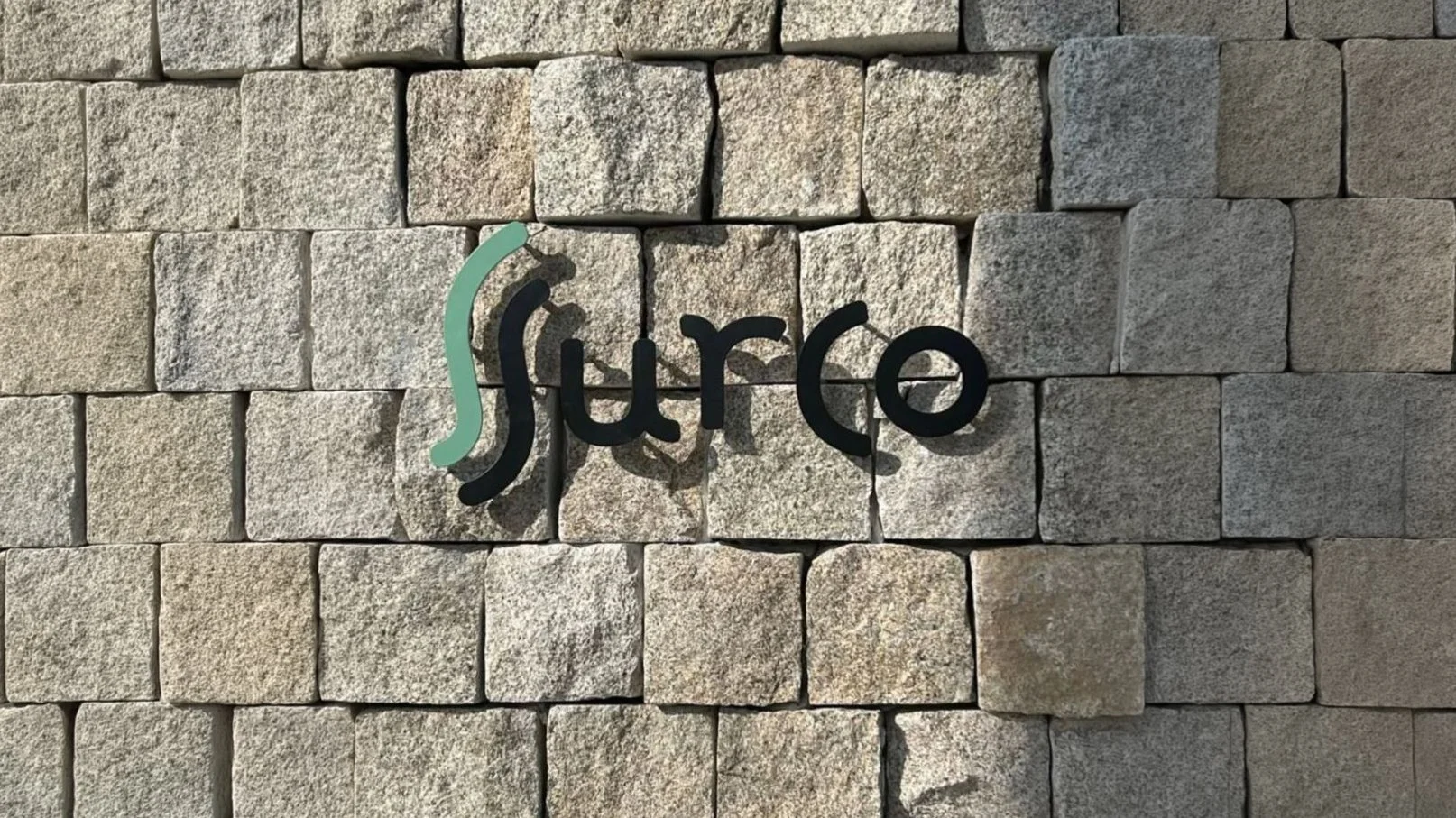
SURCO's logo isn't just a visual identity — it's a representation of its philosophy. The stylized double S forms a furrow, a line that moves with fluidity, reflecting the balance between precision and simplicity. The two S's also evoke the steam rising from the kitchen. Like the two S's, these ideas run side by side: the rigorous technique behind every dish, and the simplicity of a kitchen that respects tradition and delivers flavor exactly as you'd expect it. They complement each other and flow in harmony — creating the essence of SURCO.
Early sketches exploring the double S, drawn from the shape of the huertos — the circular growing plots the restaurant draws its produce from. Playful from the start, never precious about it.
- Brand identity
- Logo design
- Typography usage
- Color palette design
Colour
03 I Its own kind of quiet
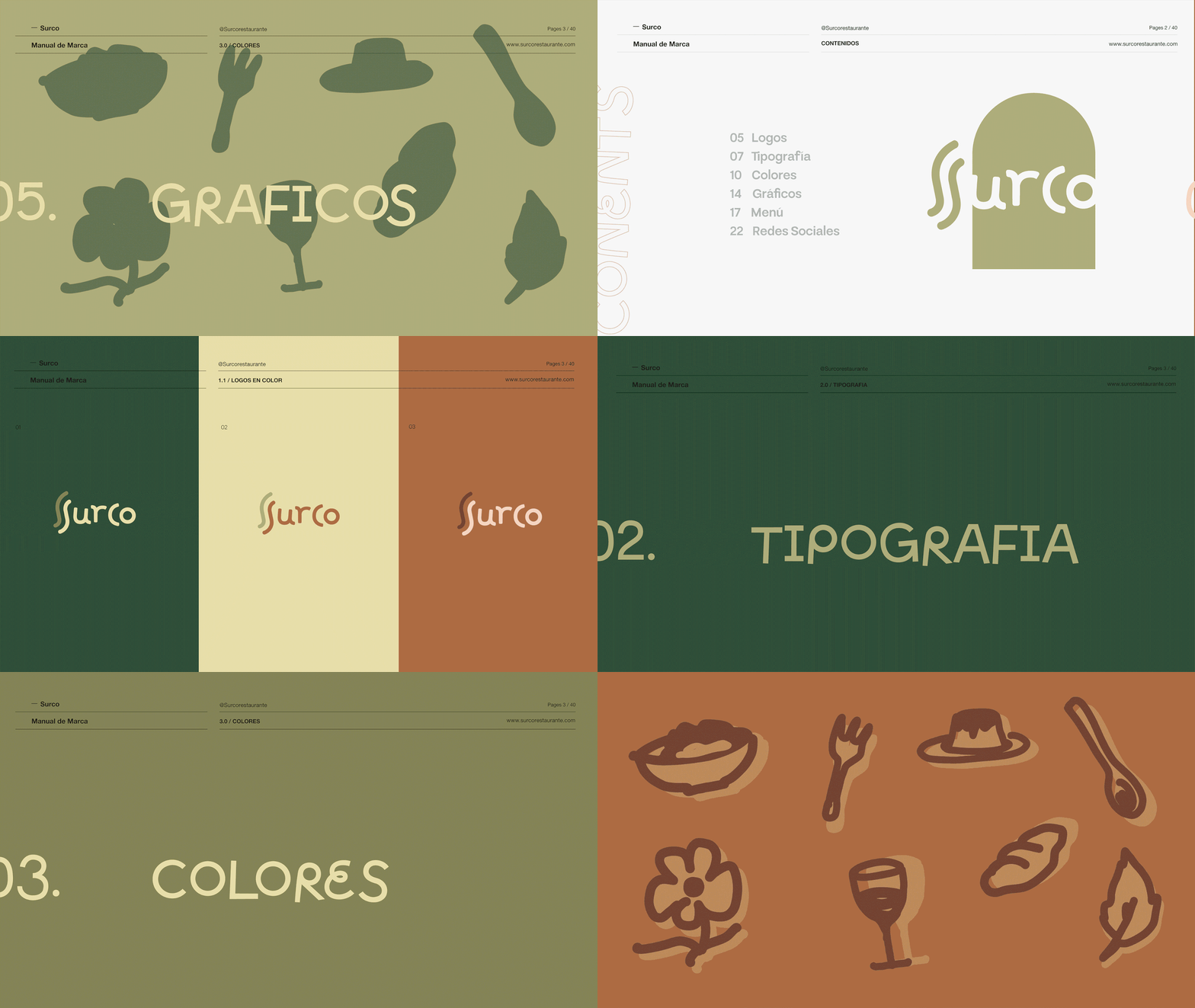
Surco wears its own personality: earthy, wood, plants everywhere. The palette had to feel like the room before it said anything else.

- Motion graphics
- Logo design
Typography · Graphic language
04 I Friendly, not stiff
the typography had to be friendly and easy, not stiff. Same instinct shaped the icon set: playful marks built as an open system, made to keep growing rather than stay fixed.
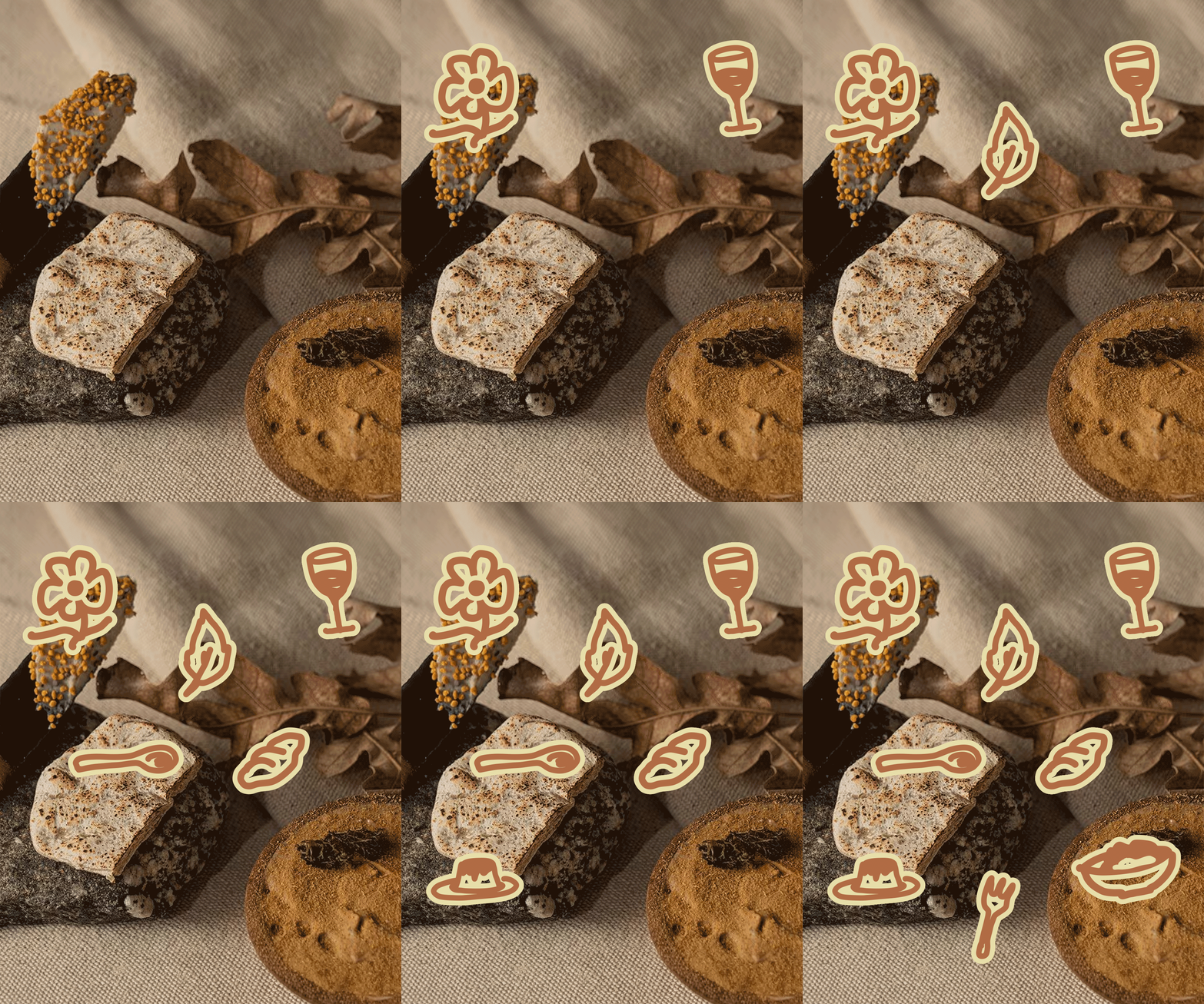
- Menu design
Applications
05 I Out in the wild
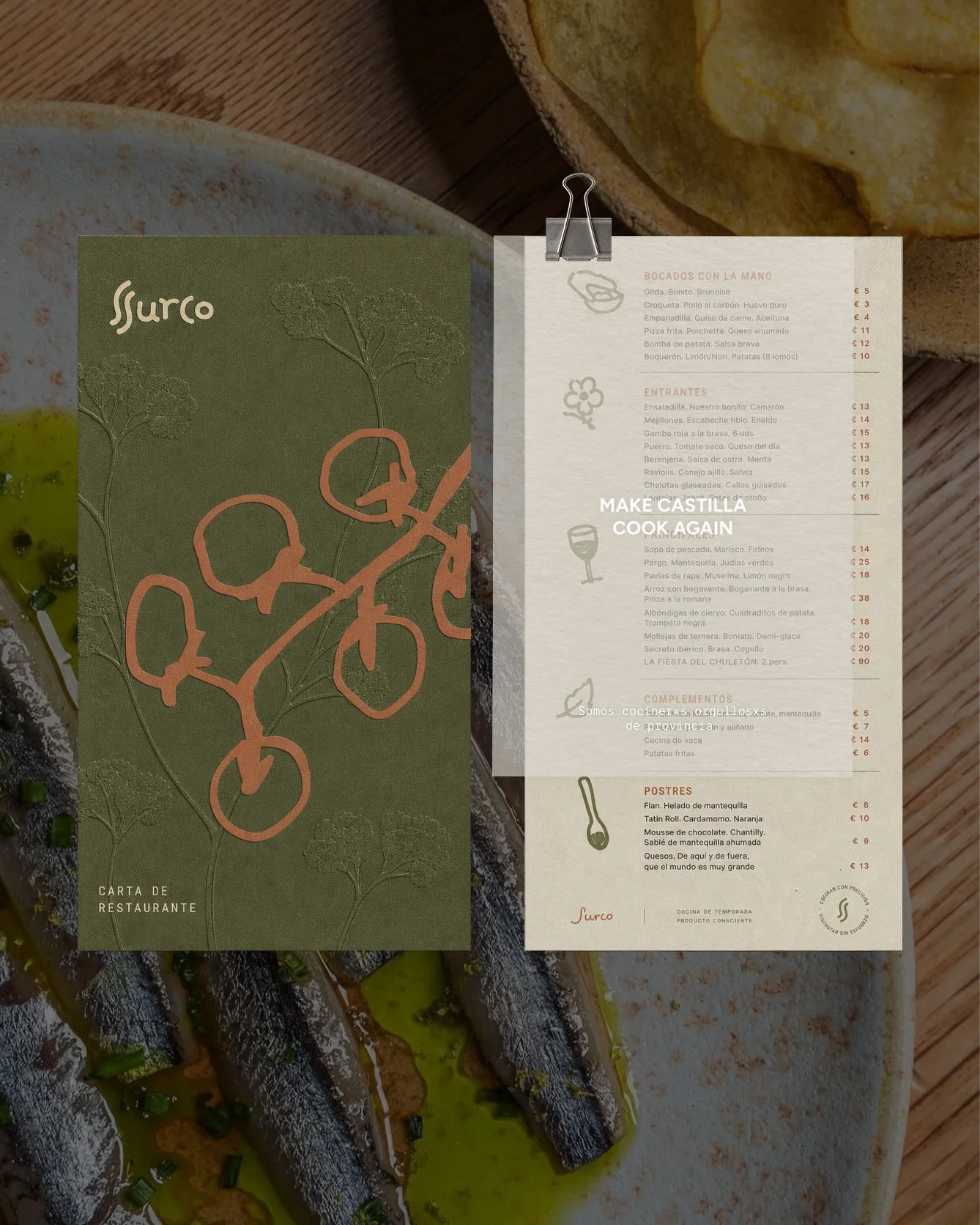
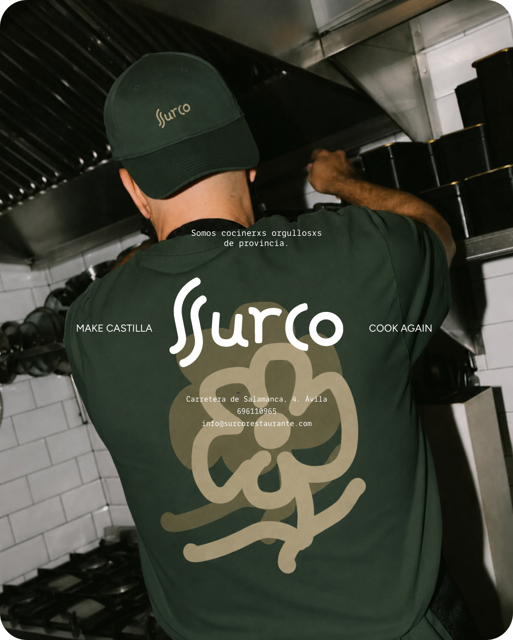
the menu, the merch, the icon set out in the wild. Full creative direction across every piece, moving fast without cutting corners on any of it.
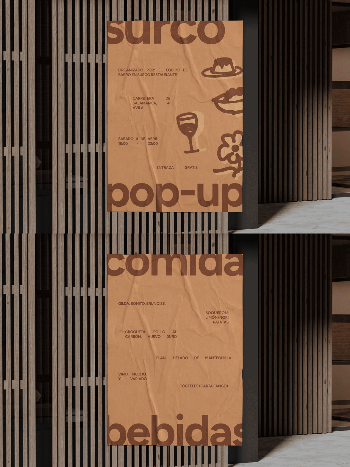
- Poster design
- Branding collateral
- Marketing design
Applications · Launch poster
06 I Said in a glance
high-end without the seriousness. Surco's the looser, more exploratory sibling to Barro, and the poster had to say that in a glance.
- Brand identity
- Creative direction
- Packaging design
Applications · Kitchen
07 I Past the dining room
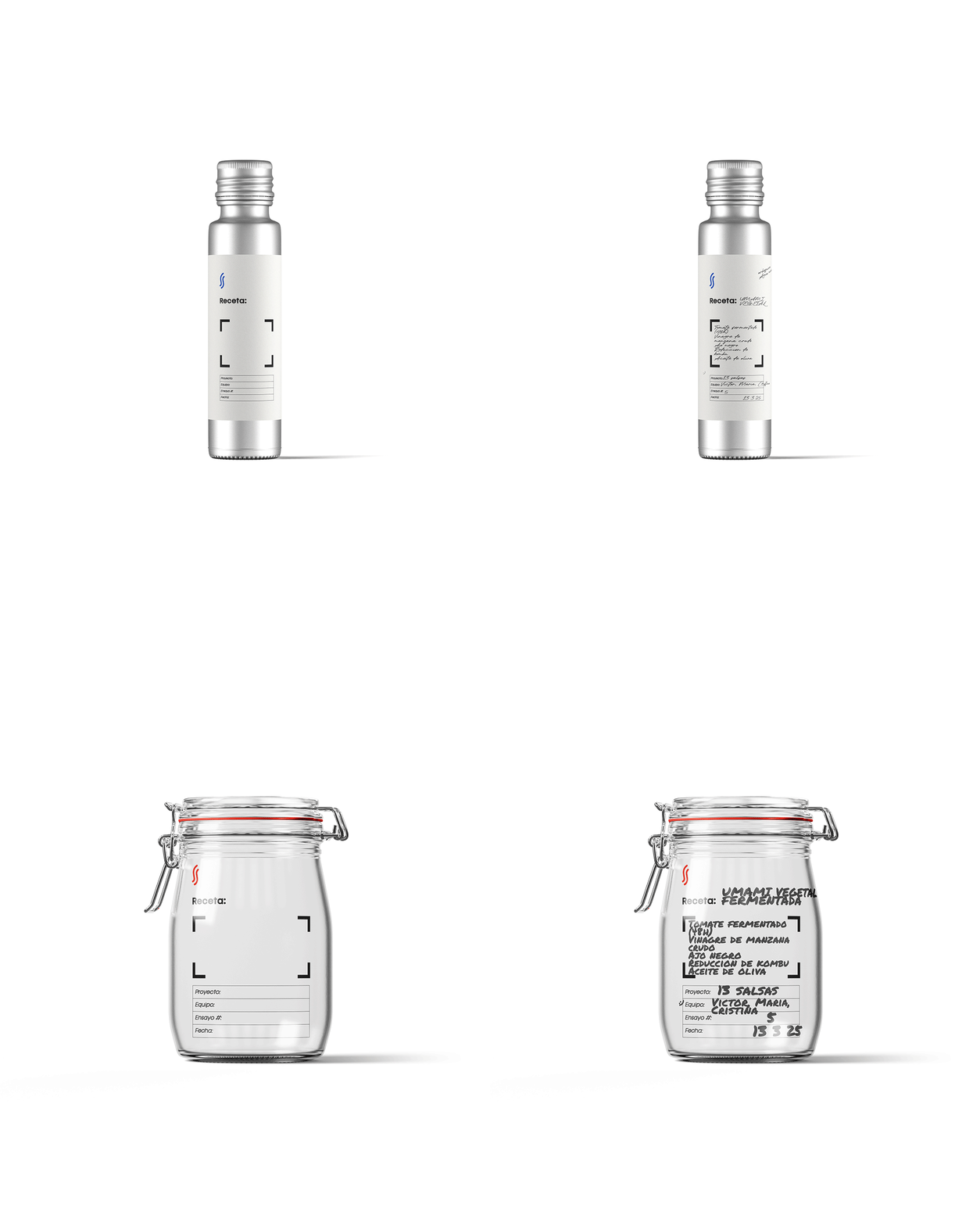
the identity went past the dining room and into the kitchen itself: a tagging system for the test jars, so cooks could log which sauce, which ingredient, which trial number, mid-experiment.
- Brand identity
- Logo design
Closing
08 I A furrow in the earth
That same harmony is what you feel in the restaurant itself: a sense of ease, of trust that every dish will be exactly what it should be. Like the line of a furrow in the earth, the experience at SURCO is natural, honest, and full of purpose.