
Context
01 I Care, crafted for all women
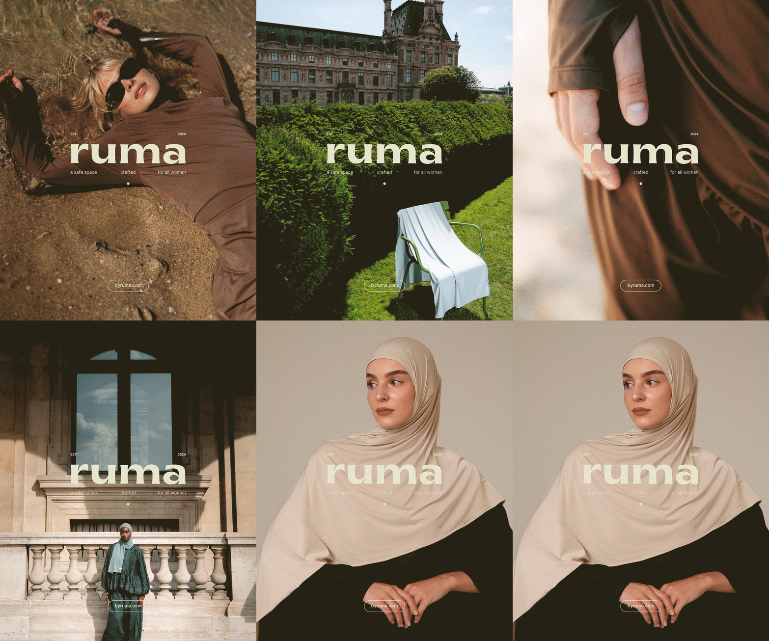
Ruma is a wardrobe brand built around modesty and comfort, made for all women and open to growing into new categories. It needed a full identity that feels warm, considered and flexible, from logo to unboxing.
What I did
- Logo design
- Stationery design
- Brand collateral
- Tags design
- Packaging design
- Shipping design
- Brand development
- Logo design
- Creative direction
Direction
02 I Before it had a shape
Ruma needed an identity built for a specific kind of customer — one looking for care as much as craft. The brand spans a wardrobe built around modesty and comfort, with room to grow into new categories over time, so the wordmark had to stay flexible across all of it: soft, unhurried, lowercase, never shouting for attention.
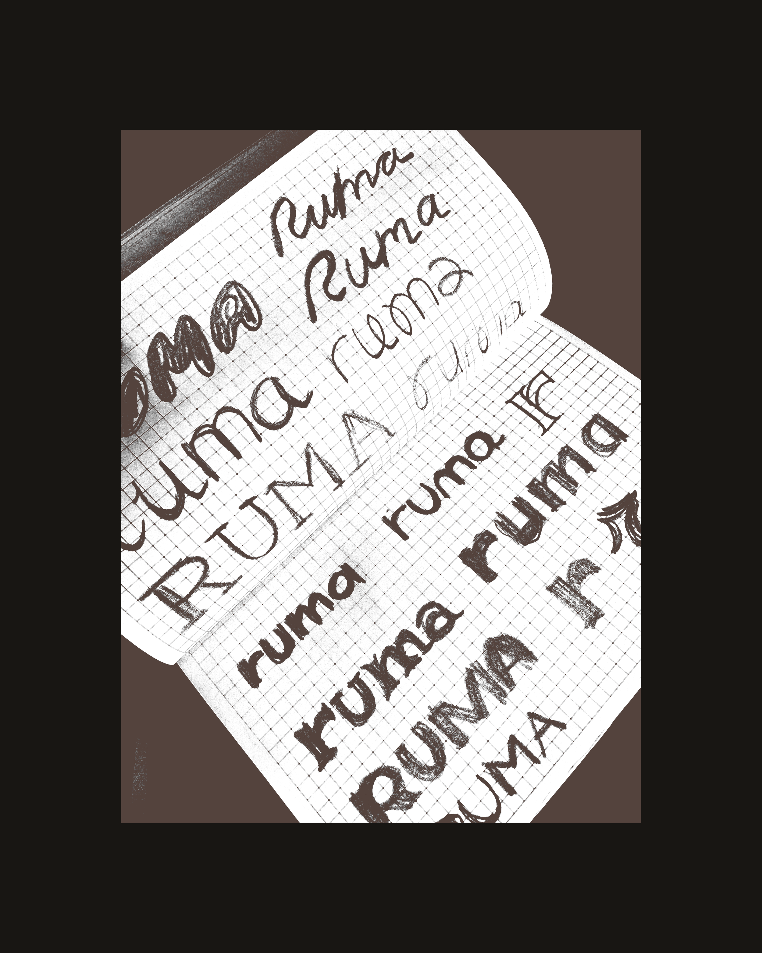
The mark went through rounds of sketching before anything was decided — testing how much personality a single letterform could carry without tipping into cute. The brief called for something slightly playful, but the kind of playful that still reads considered, trendy without losing the clean edge underneath.
- Brand identity
- Brand collateral
- Stationery design
Visual system · Texture
03 I Texture carries the message
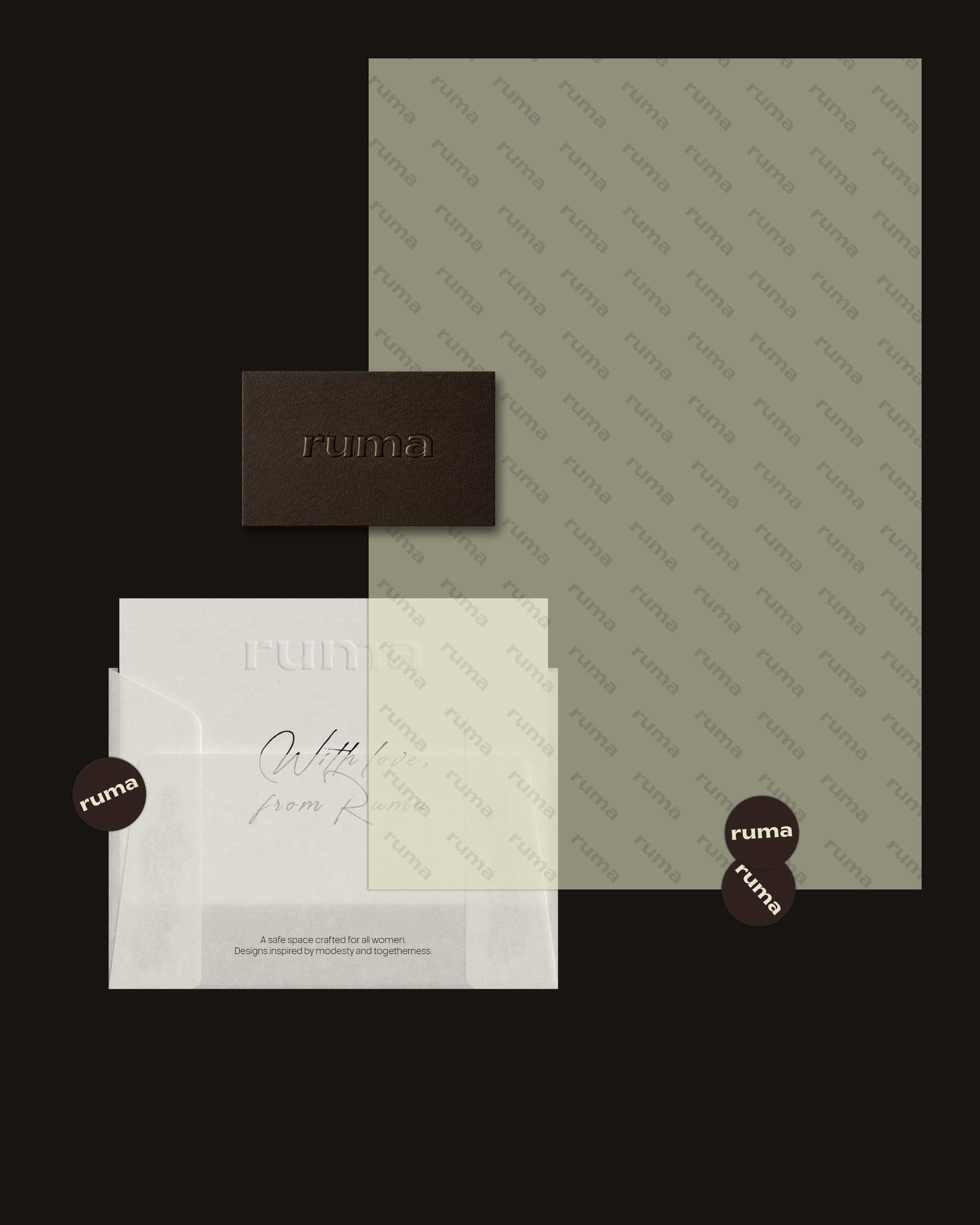
Rather than lean on color alone, the system leans on touch — paper grain, fabric, natural surfaces, all folded into the visual language early. Modesty and togetherness aren't abstract values here; they're built into how everything feels before it's ever read.

- Logo design
- Brand identity
Graphic language · Mark
04 I A mark that folds in on itself
The final symbol reads like a fold — a soft, circular form that echoes the drape of fabric, landing somewhere between a monogram and a seal. It had to work small, stamped into leather or embossed into paper, and still feel intentional at any size.
- Stationery design
- Tag design
- Brand collateral
Applications · Packaging
05 I Everything in its place
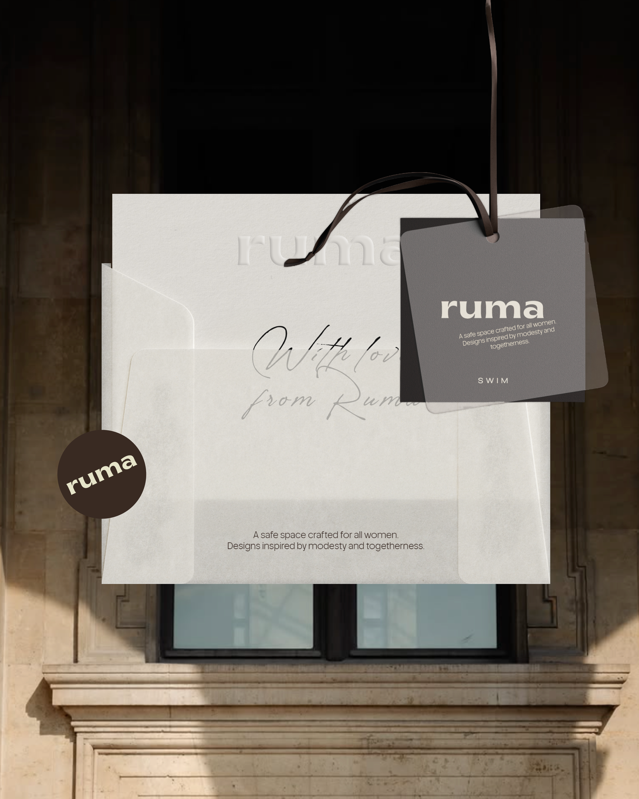
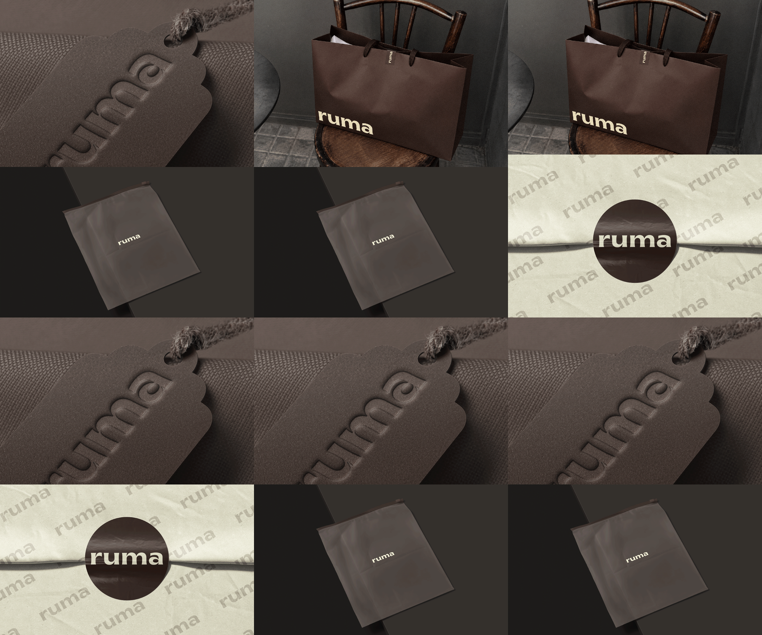
Every touchpoint got the same attention — tags, stickers, tissue, the box itself — built as one full unboxing sequence rather than a logo applied after the fact. The packaging needed to feel like an extension of the product, not decoration around it.
- Brand identity
- Packaging design
- Shipping design
Closing
06 I Soft on the outside, considered within
The neutral browns and beiges carry through everything, warm rather than muted, elevated without ever feeling cold. A brand built to feel like care from the moment it arrives — crafted, quite literally, for all women.