
Context
01 I Skin is structure, not surface
Naulen is a skincare brand that treats skin from within, with formulas designed to support its structure rather than promise transformation. It needed a full branding as calm, clear and precise as the formulas themselves.
What I did
- Logo and icon design
- Typography
- Color palette and usage
- Tone of voice and copywriting
- Photography direction
- Packaging design
- Typography
- Logo design
- Brand identity
Typography
02 I Letters with a job to do
A lowercase wordmark, soft rounded letterforms, and a full stop to close it, a name that says what it is and then stops talking.
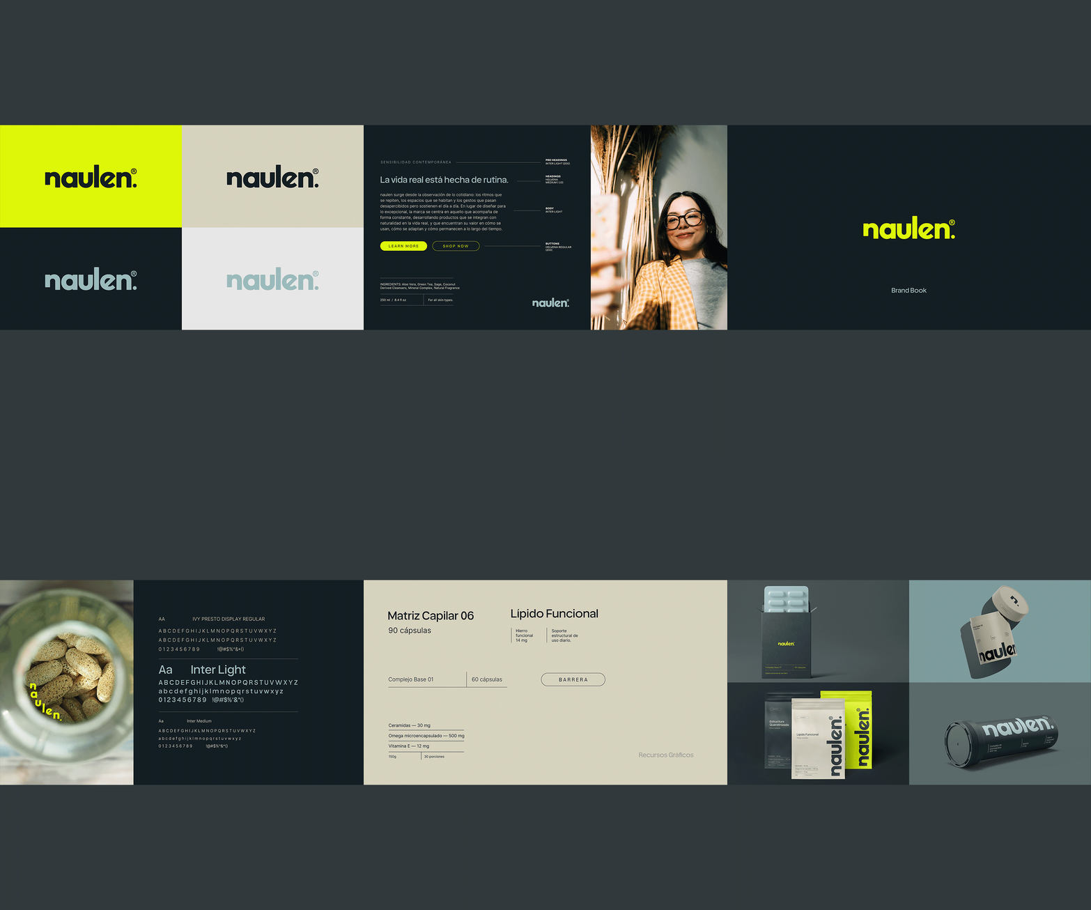
Type follows the same rule as the formulas: nothing is there for decoration. A display serif brings presence in the few places that need it, a rounded sans gives the wordmark and headlines their warmth, and a light, plain workhorse carries what people actually need to read, from dosages to ingredients to instructions.
- Typography usage
- Tone of voice
- Copywriting
- Web design
Typography · Digital
03 I Clinical, never cold
On screen, the type does the quiet work. Small, widely spaced pre-headings set the context, tight medium-weight headlines carry the point, and light body text keeps longer reads easy on the eye. The words follow the same rule: plain, descriptive, no promises. Precise enough to trust, relaxed enough to read.
- Brand guidelines
- Color palette
- Brand identity
- Brand development
Brand guidelines
04 I Everything in its place
All of it comes together in the brand guidelines: how the logo is used and where it needs room, which colors lead and how much of each, the type, the lines, the shapes. Deep ink, pale sage, warm stone and soft grey carry almost everything, and a single acid lime is kept for the moments that have to be seen. Clear rules, so the brand stays calm as it grows.
- Creative direction
- Photography direction
- Packaging design
Creative direction
05 I The quiet part of care
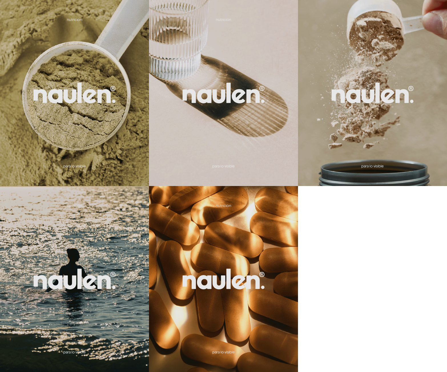
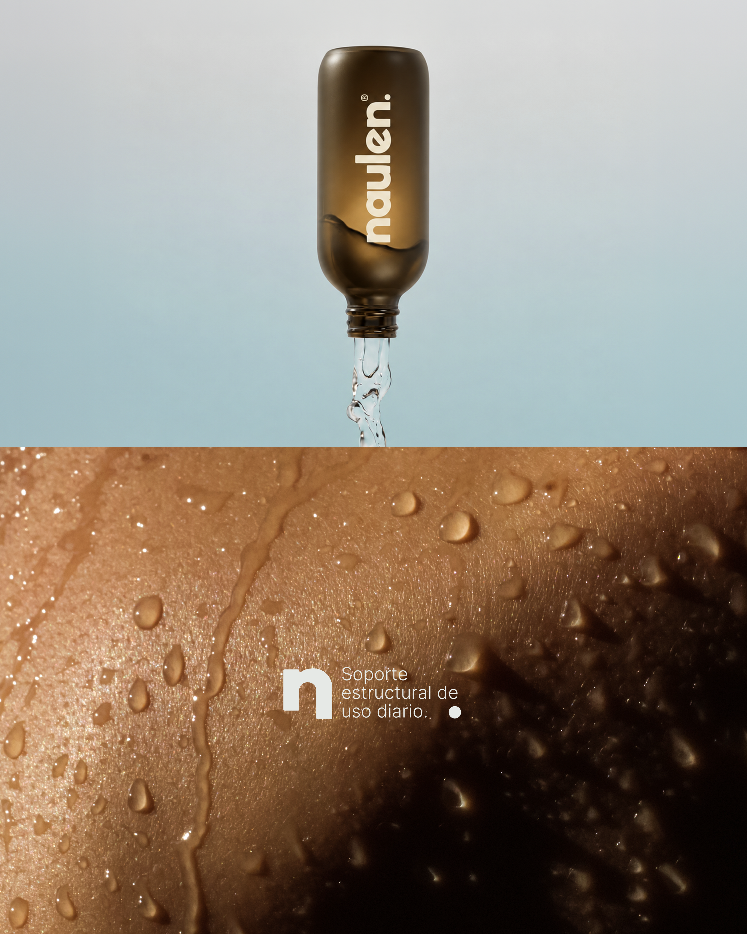
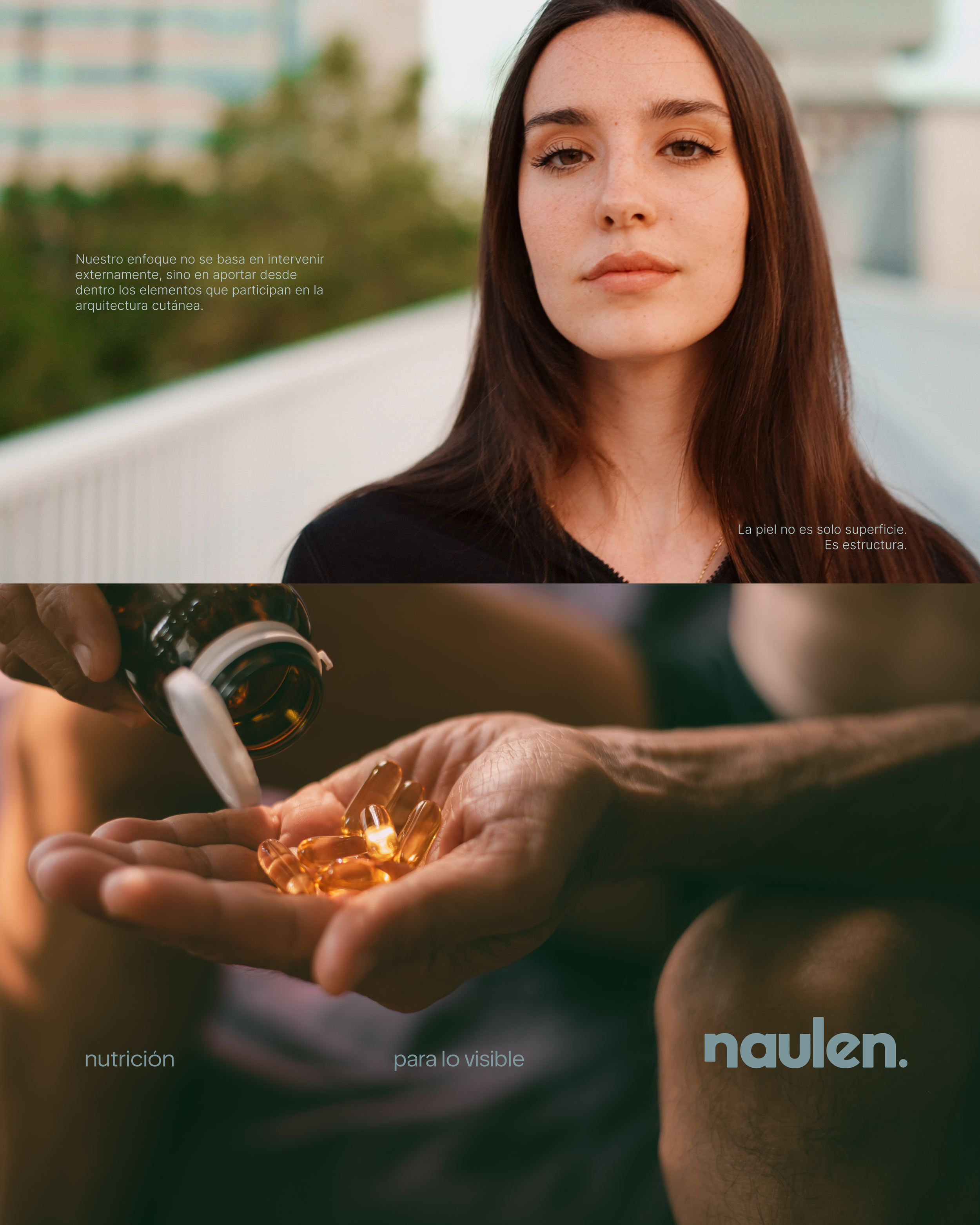
The creative direction starts from stillness. Water, light, skin, the small daily moments nobody stages for a camera. Nothing here is trying to impress. Each frame just asks you to slow down long enough to notice what was already there.
- Packaging design
- Art direction
- Photography direction
Photography · Texture
06 I Texture, from the shot to the shelf
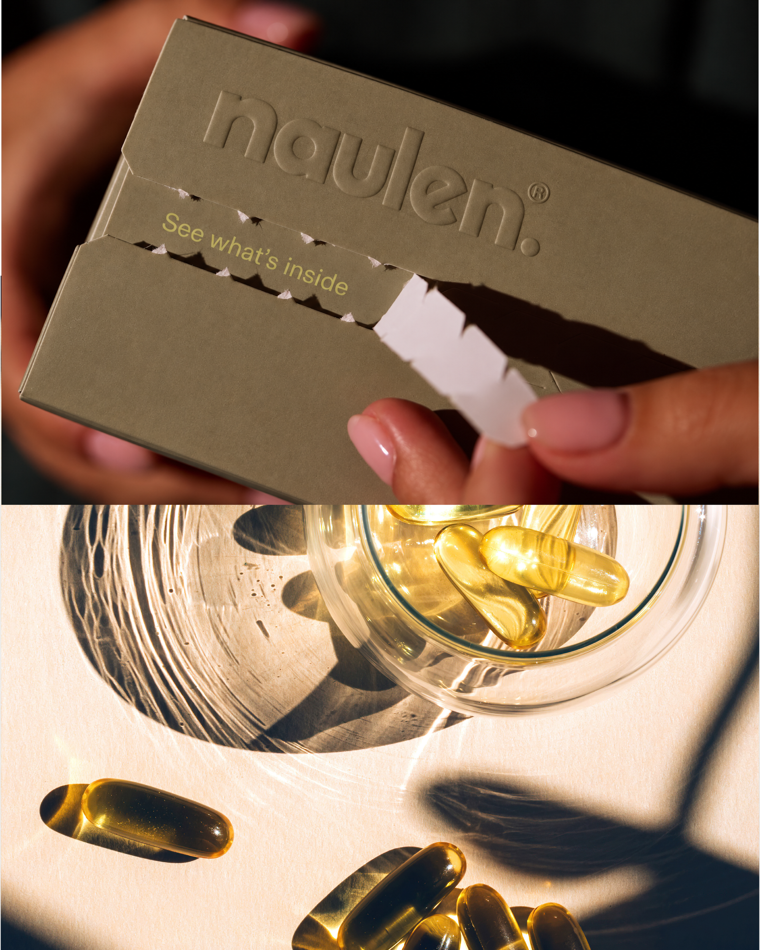
Texture became the thread running through everything. In the photography, directional light picks out grain, density and sheen in capsules, powders and skin. In the packaging, matte surfaces and tactile board carry the same idea, so what you see is already close to what you'd feel.
- Graphic language
- Brand identity
Graphic language
07 I Structure, drawn in thin lines
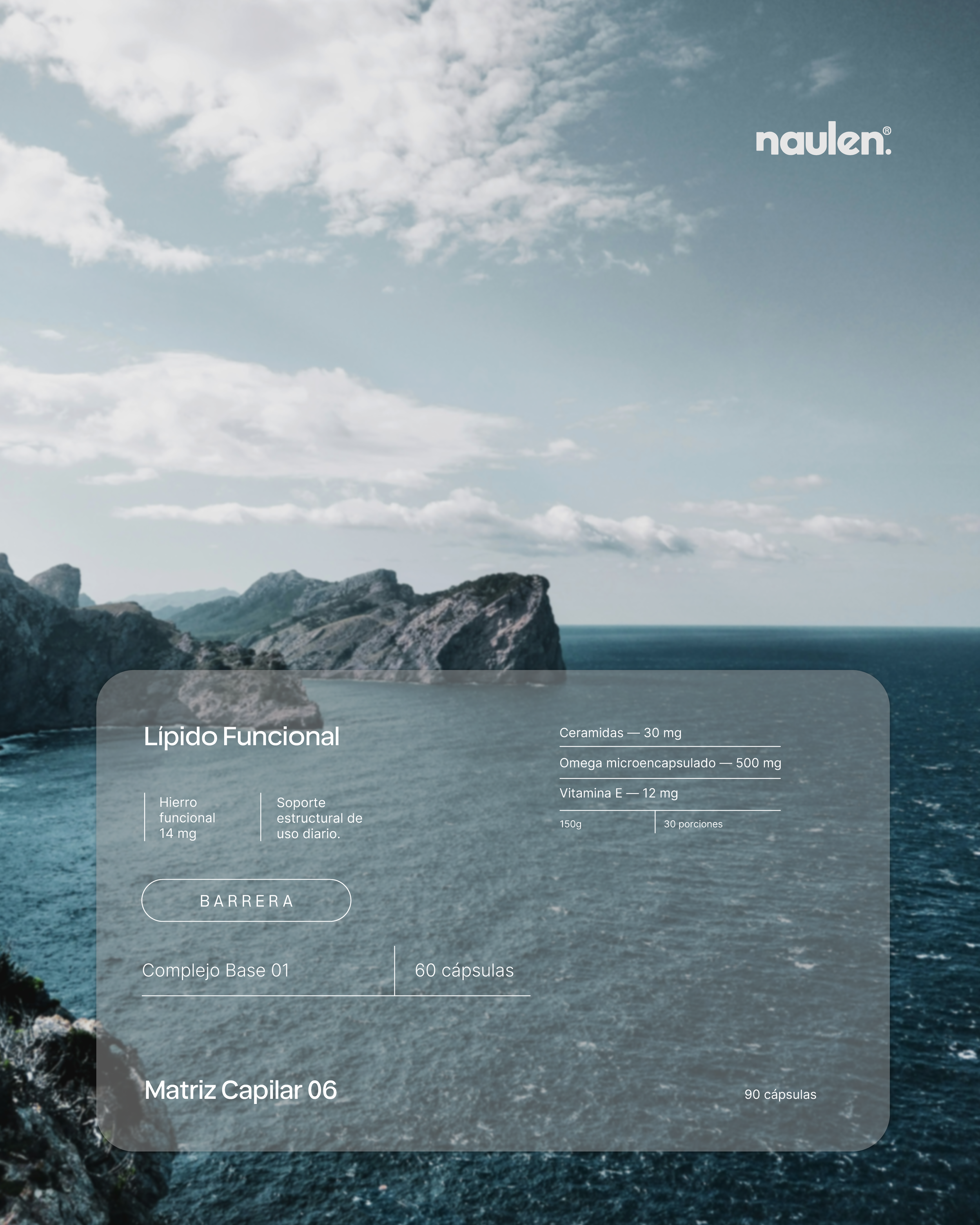
Thin vertical and horizontal lines organize the information and set the rhythm, and every container borrows the same heavily rounded shape from the capsule itself. The goal was never to decorate, only to put things in order.
- Packaging design
- Pouch design
- Box design
- Brand identity
Applications · Packaging
08 I One logic, many shapes
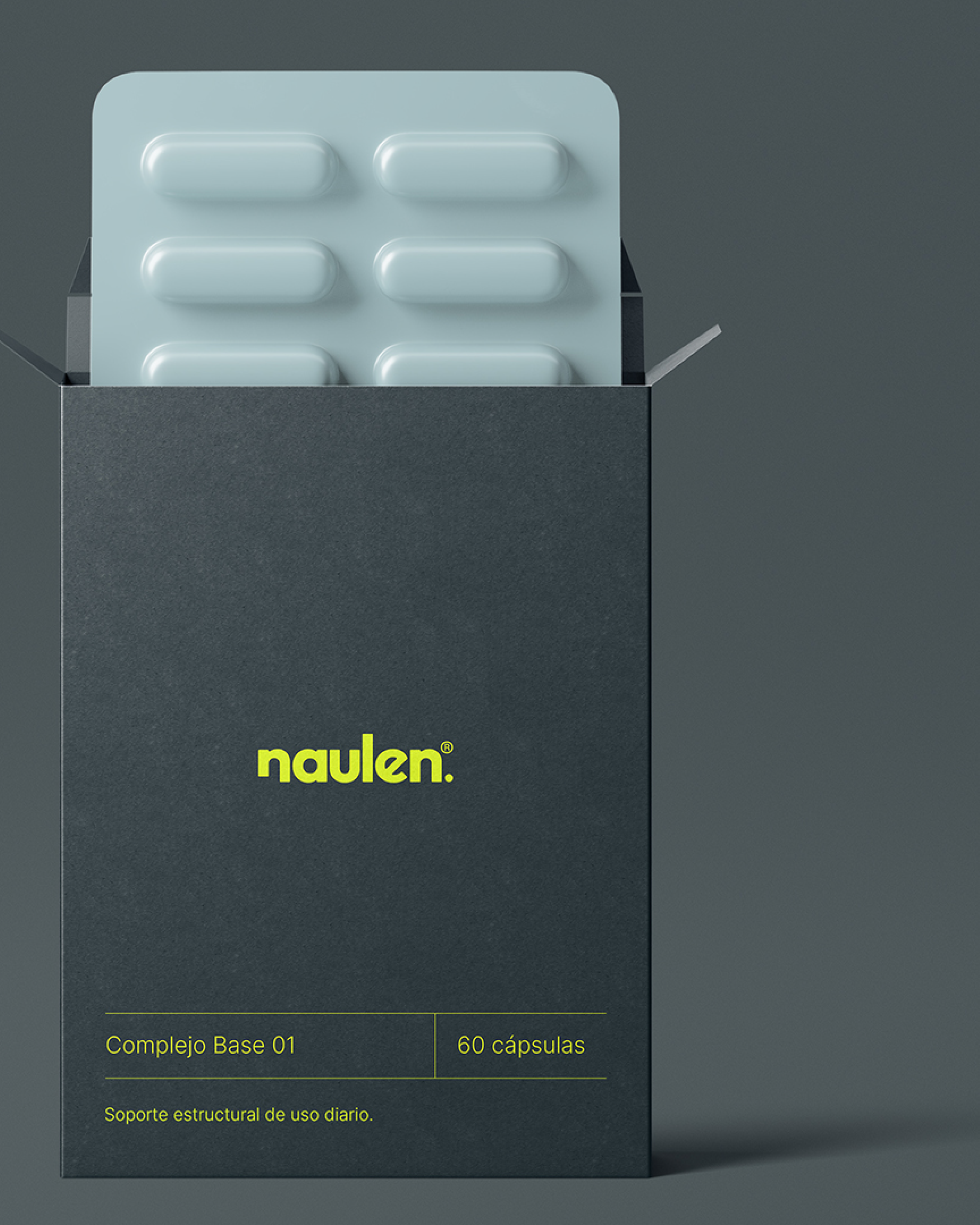
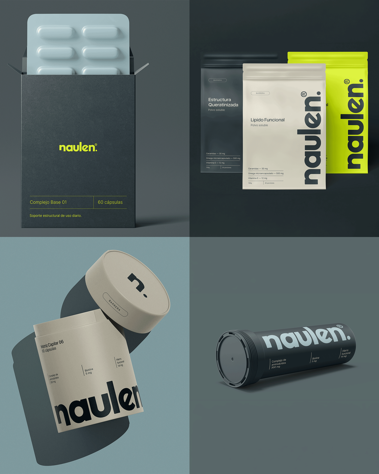
Pouches, tubes and folding boxes all share one plain structure: the name, what's inside, how much, how often. The line can grow from capsules into powders and beyond and still read as one thing, because everything it shows is something it can stand behind.