
Context
01 I Made for the moment before
INNI is a pre-drink supplement, made to be taken right before the night begins. It needed a brand that felt like anticipation rather than wellness, from the first idea of a name to the shelf.
What I did
- Logo design
- Branding
- Creative direction
- Typography design
- Packaging design
- Photography direction

- Brand development
- Creative direction
- Logo design
Direction
02 I An alternate expression
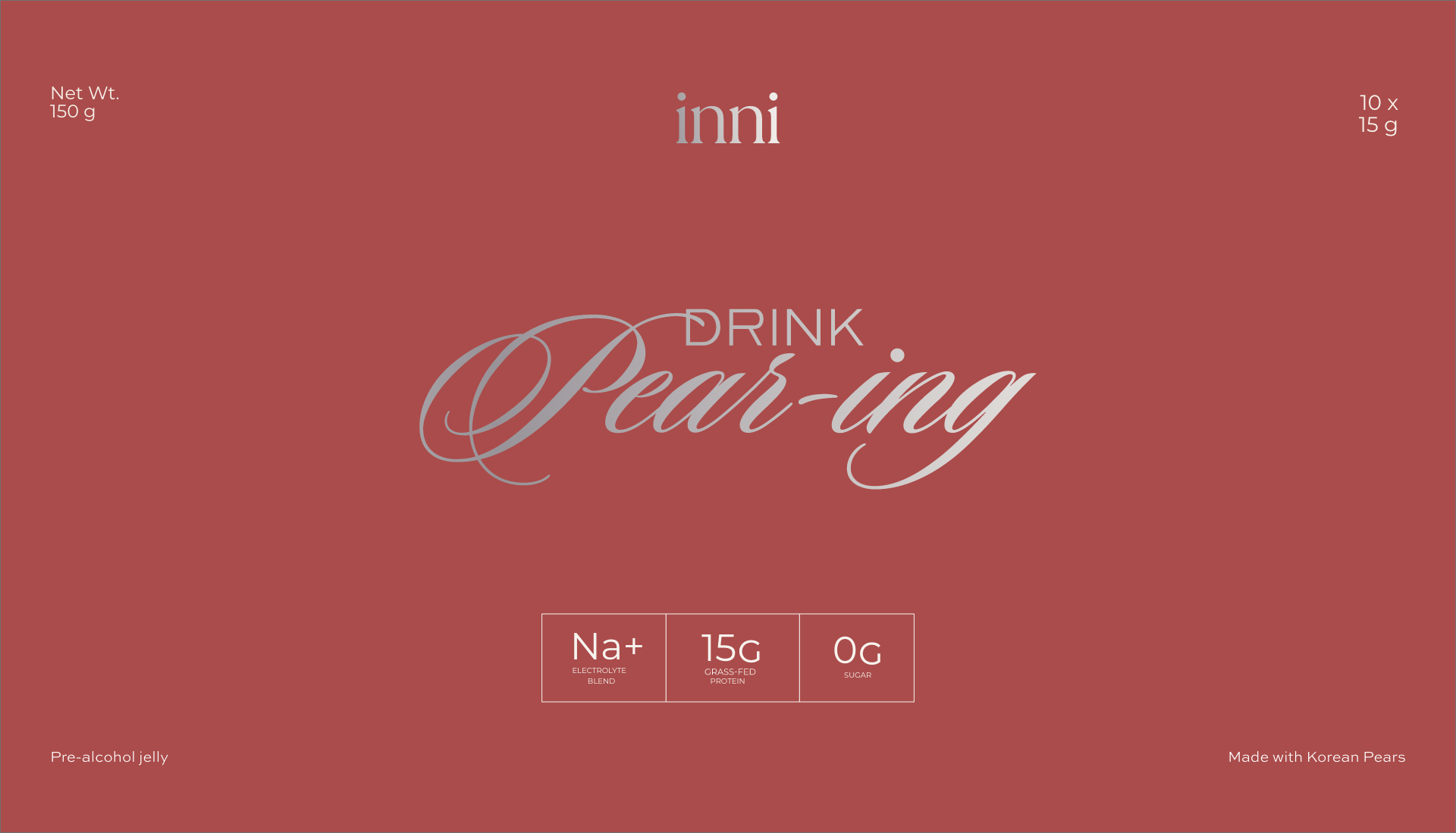
INNI's first product needed a feeling before it needed a name. We started with dusk — that quiet pause between day and night, right before the evening's ritual begins.
Not a rebrand — a full exploratory direction, built out completely before anything was locked in. Silver, chrome, candlelight, and the confidence of a moment about to happen.
- Typography design
- Brand identity
- Packaging architecture
Typography
03 I Fluid, then restrained
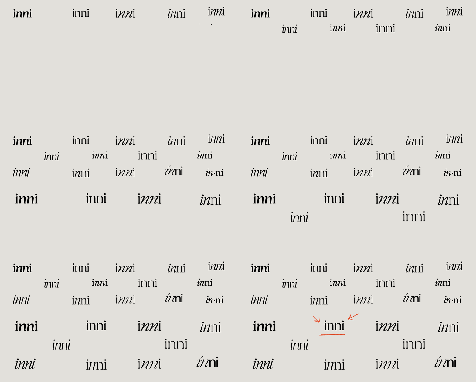
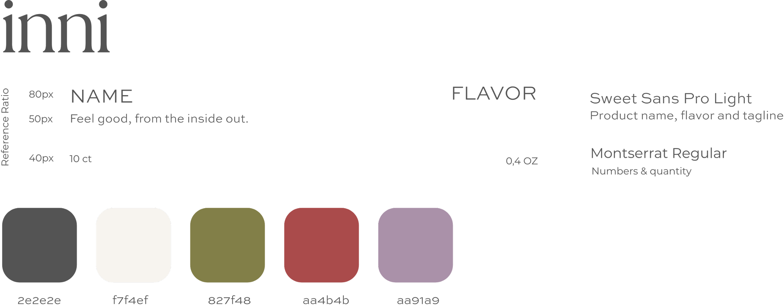
A cursive script carries the romance; a quieter serif holds the structure beneath it. Script as one feature among several — never the whole system.
- Color palette
- Typography usage
- Brand identity
Colour
04 I Indulgent, not loose
Clinical white was never the direction. The palette leans into low light and metal instead — indulgent, but still under control.
- Packaging design
- Dieline design
Naming exploration
05 I Testing a feeling, not a name
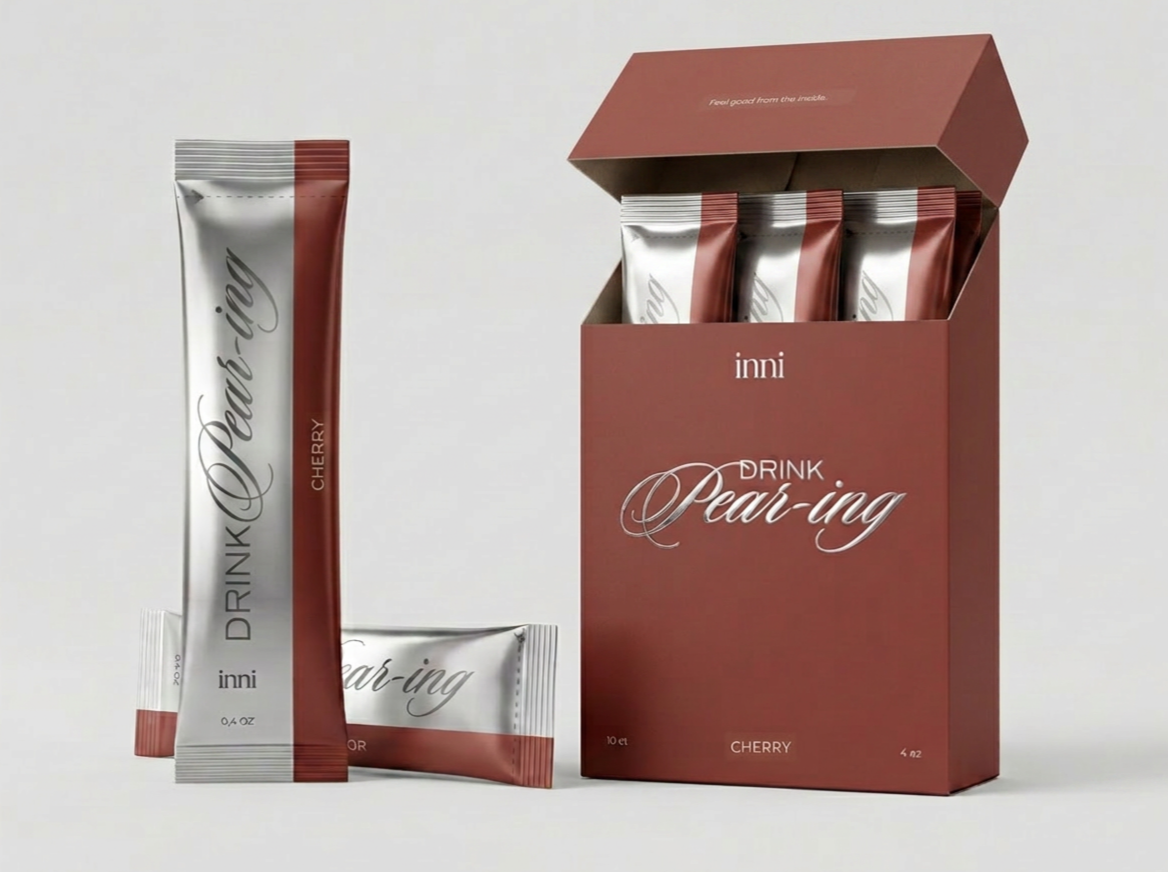
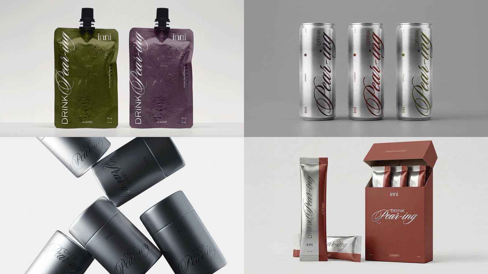
Names like "drink pear-ing" and "predrink" were never meant to be final — they were tools, tested against type and material to see what tone actually felt right.
- Packaging design
- Product design
Design logic
06 I Two seconds, or it's not working
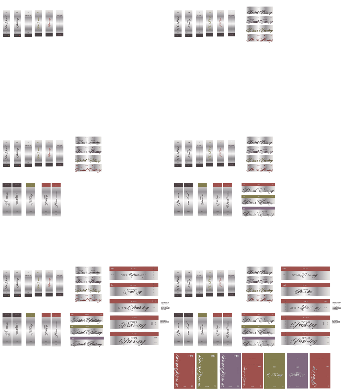
The rule stayed simple throughout: if it didn't read as anticipatory within two seconds, it wasn't finished yet.
- Packaging design
- Brand development
- Strategic design
System · Stick packs
07 I One system, many quiet variations
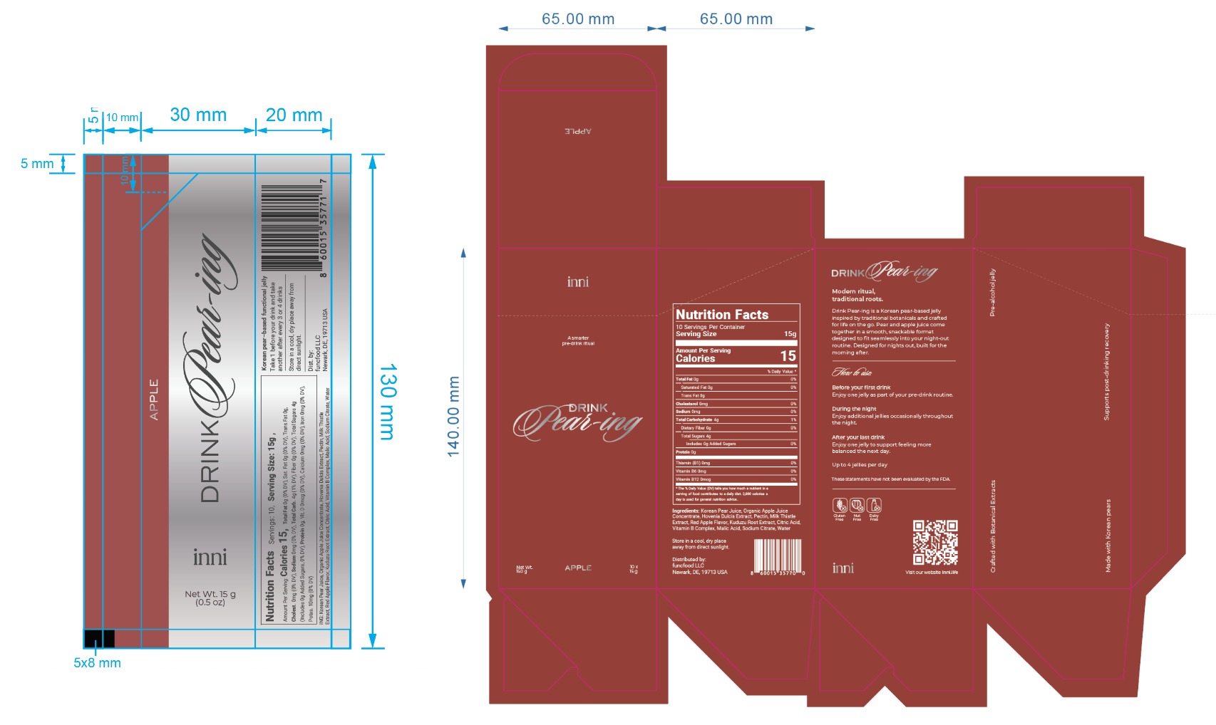
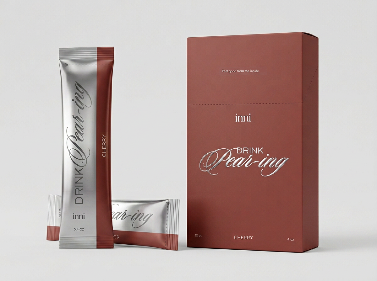
Built to hold every flavor without losing the thread — same stick pack, same logic, a small variation underneath each one.
- Packaging design
- Retail photography
Applications · Display box
08 I Visible before it's opened
The display box had to do the same work at a larger scale — the ritual, readable on a shelf before anyone picks it up.
- Photography direction
- Art direction
Photography
09 I Dark, flirty, deliberate
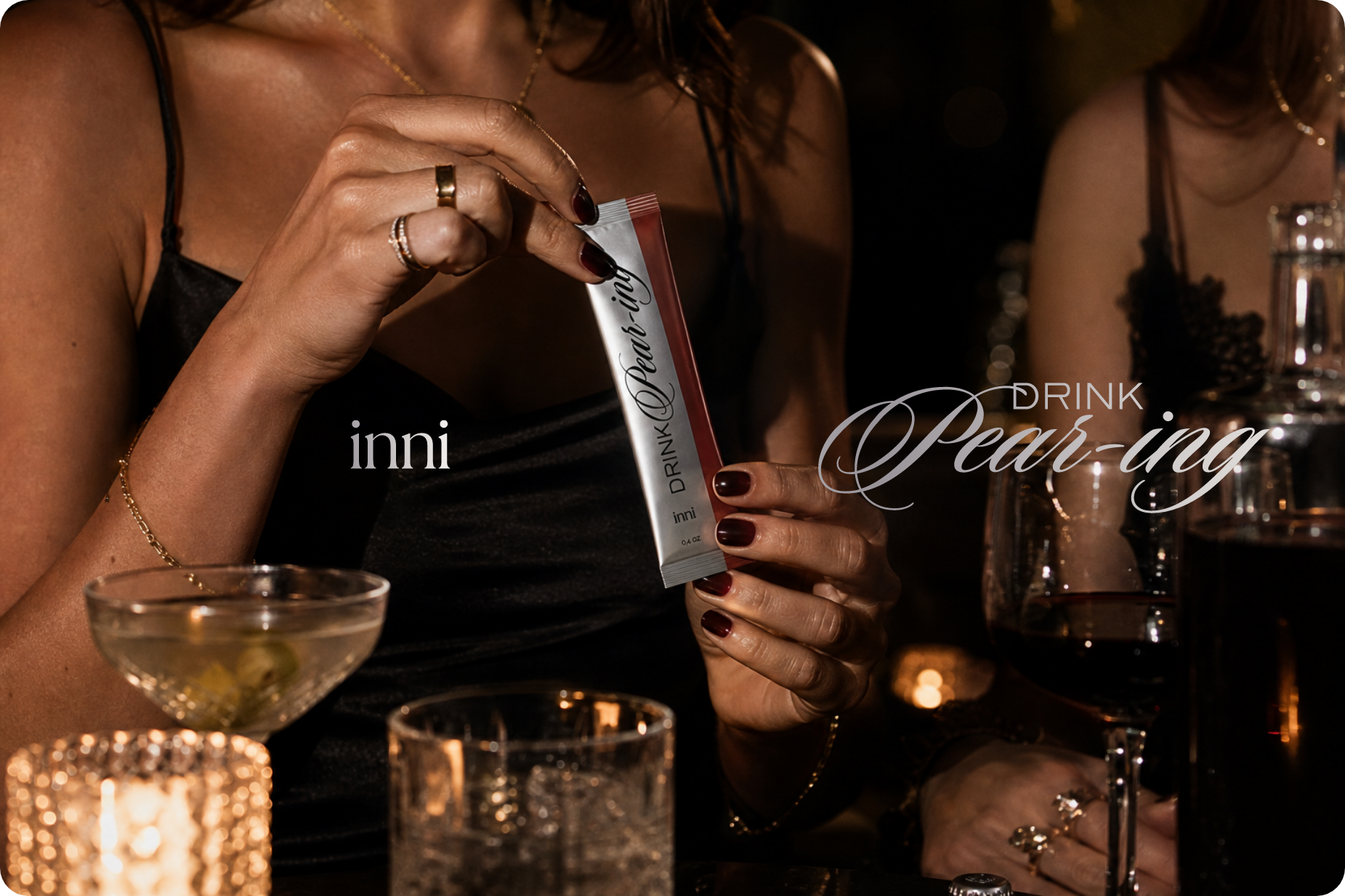
Vintage glass, low flash, a little flirtation — every choice pulling away from anything that looked like a supplement.
- Brand identity
- Creative direction
- Packaging design
Closing
10 I A ritual, not a routine
What it became reads less like wellness packaging and more like something you'd reach for right before the night starts.